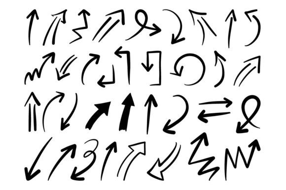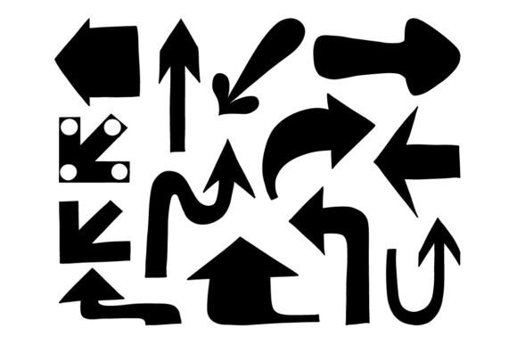
Arrow Direction Set Bold Icon Pack SVG: Clarity, Consistency, and Creative Flexibility
When visual communication needs to be instantly understood—whether guiding a user through an app, directing foot traffic in a public space, or clarifying data flow in a presentation—the right arrow icon does more than point. It builds trust, reinforces hierarchy, and silently shapes behavior. The Arrow Direction Set Bold Icon Pack SVG meets that need with precision: a thoughtfully curated collection of directional icons designed for impact without clutter.
Bold Simplicity That Scales Without Sacrifice
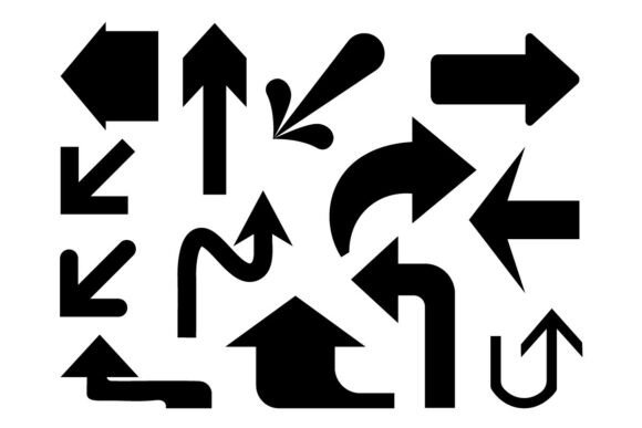
This isn’t a set of decorative flourishes. Every arrow in the Arrow Direction Set Bold Icon Pack SVG is built on two foundational principles: boldness and minimalism. The strokes are confidently weighted—not thin enough to disappear at small sizes, not heavy enough to overwhelm at large ones. Corners are crisp but never harsh; curves are smooth and intentional. There’s no unnecessary detail, no subtle gradients or shadows—just clean vector geometry optimized for legibility across contexts.
That simplicity pays off immediately in real-world use. A forward arrow used in a mobile navigation bar stays sharp on a 320px-wide screen. The same icon, scaled up for a wayfinding sign in a hospital corridor, retains its clarity from six meters away. Because each shape is mathematically precise—not hand-drawn or raster-based—it resizes infinitely without pixelation or distortion. That’s the inherent advantage of SVG, and this pack leverages it fully.
More Than Just “Left” and “Right”: A Full Directional Vocabulary
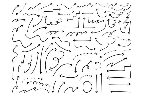
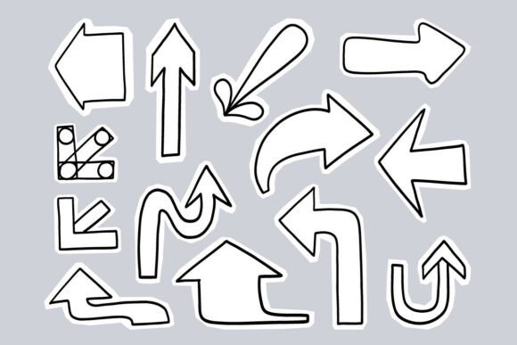
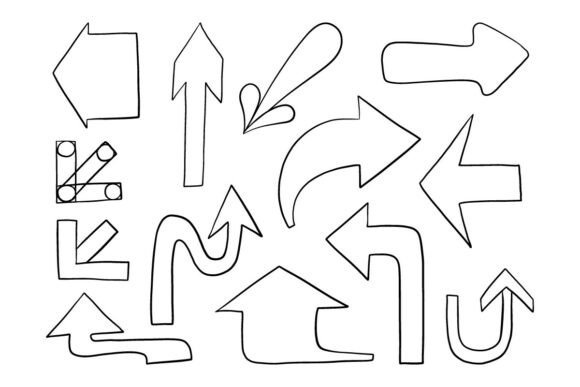
The Arrow Direction Set Bold Icon Pack SVG goes well beyond basic cardinal directions. It includes:
- Straight arrows: Up, down, left, right—and double-headed variants for bidirectional flow or comparison.
- Curved arrows: Clockwise and counterclockwise loops, ideal for indicating rotation, recycling, or process cycles.
- Dynamic arrows: Diagonal, branching, merging, and angled forms that suggest movement between states, transitions, or layered relationships.
- Contextual variants: Arrows with subtle tails, arrows ending in dots or bars, and directional pointers with embedded icons (like play or send symbols) for added semantic meaning.
This range matters because real projects rarely demand just one kind of direction. A SaaS dashboard might use a curved arrow to indicate data syncing, a diagonal arrow to show workflow progression, and a bold downward arrow to highlight a scroll-triggered section. With this pack, designers don’t need to mix disparate icon sets—or worse, improvise inconsistent custom shapes. Everything shares the same visual DNA: weight, spacing, corner radius, and stroke consistency.
Designed for Real Workflows—Not Just Mockups
Compatibility isn’t an afterthought here. The Arrow Direction Set Bold Icon Pack SVG ships with multiple formats—SVG, PNG, EPS, and JPG previews—so teams can plug them in without friction. SVG files work natively in Figma, Adobe XD, Sketch, and modern browsers. PNGs (in multiple resolutions) slot into PowerPoint, Keynote, or static websites where vector support isn’t available. EPS ensures print-ready fidelity for signage or branded collateral. And JPG previews let stakeholders quickly scan options during early-stage reviews.
Each file is individually named and logically grouped—no hunting through nested folders for “arrow-up-bold-02.svg”. Colors are set to neutral black or outlined with transparent fills by default, making recoloring effortless in design tools or CSS. No hidden layers, no embedded fonts, no locked assets. What you see is what you edit.
Where These Arrows Actually Shine
It’s one thing to say “great for UI”—but where do these arrows deliver measurable value?
User Interface & Web Design
In interfaces, arrows often serve as silent instructors. A bold right-pointing arrow next to a “Continue” button reduces cognitive load. A looping arrow beside a “Refresh” action signals repetition without needing text. Because the Arrow Direction Set Bold Icon Pack SVG uses consistent proportions and spacing, developers can build reusable React or Vue components that scale predictably across breakpoints—no manual tweaks per screen size.
Infographics & Data Storytelling
Arrows in charts or flow diagrams aren’t decorative—they’re structural. A thick, tapered arrow connecting two metrics implies causality. A dotted curved arrow around a cycle visualizes feedback. This pack’s dynamic arrows give data designers expressive yet professional options that avoid cartoonishness or ambiguity. They integrate cleanly with charting libraries like Chart.js or D3 when exported as inline SVG.
Presentation & Pitch Decks
PowerPoint and Google Slides users benefit most from the included high-res PNGs. A bold upward arrow next to a KPI shows growth without needing a full graph. A branching arrow illustrates strategy pivots. Because the icons are intentionally simple, they don’t compete with content—they reinforce it. And since every arrow shares the same visual weight, slides feel cohesive, not pieced together.
Wayfinding & Environmental Graphics
For architects, signage designers, or facility managers, scalability and contrast are non-negotiable. The bold strokes in this pack ensure arrows remain legible under varied lighting—glare from glass facades, low-light corridors, or outdoor sun exposure. When output to vinyl cutters or large-format printers via EPS, edges stay razor-sharp. No anti-aliasing blur, no color shifts.
Why Designers Choose This Pack Over Generic Alternatives
Free icon libraries often offer arrows—but rarely with intentional consistency. You’ll find mismatched stroke weights, inconsistent curvature radii, or arrows that look “designed” rather than “engineered.” The Arrow Direction Set Bold Icon Pack SVG solves that by treating direction as a system—not isolated symbols.
It also avoids over-stylization. Some packs lean into skeuomorphism, 3D depth, or trendy duotones—styles that date quickly or clash with brand guidelines. These arrows are timeless in function and adaptable in form. Change the fill color to match your brand palette. Overlay a subtle drop shadow for depth in a presentation. Flip or rotate any SVG without breaking alignment. Nothing is locked, nothing is fragile.
And unlike icon fonts—which require loading external resources and can break with browser updates—these are self-contained files. No dependencies. No rendering hiccups. Just drag, drop, and go.
Getting Started Is Deliberately Simple
There’s no learning curve. If you’ve used icons before, you’ll recognize the workflow immediately: browse the folder structure, copy the SVG into your code editor or design canvas, adjust size or color as needed. For developers, inline SVG means full CSS control—hover effects, transitions, accessibility attributes (aria-label, role="img")—all preserved and easy to add.
Designers appreciate that each arrow is centered on its artboard with consistent padding. No repositioning required when swapping icons mid-project. No guesswork about baseline alignment in typography-heavy layouts. Even motion designers can animate these arrows smoothly—scaling, rotating, or morphing paths using GSAP or Framer Motion, thanks to clean path data.
Whether you’re building a fintech onboarding flow, designing an internal training module, or laying out a conference floor plan, the Arrow Direction Set Bold Icon Pack SVG delivers reliability without compromise. It doesn’t shout for attention—yet it ensures nothing gets missed.